Magazine Sneak Peek
Intent
Magazine Case Study
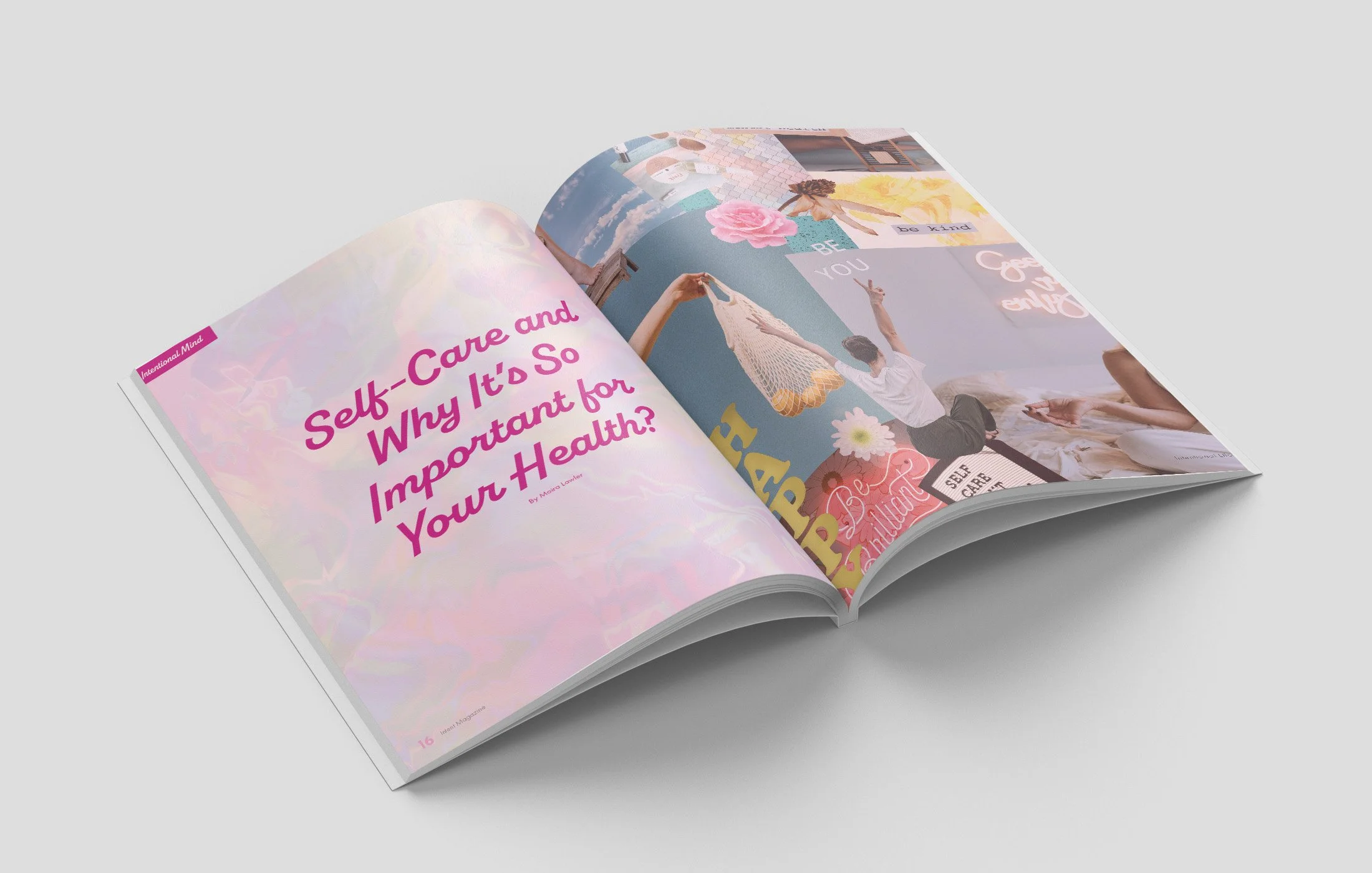
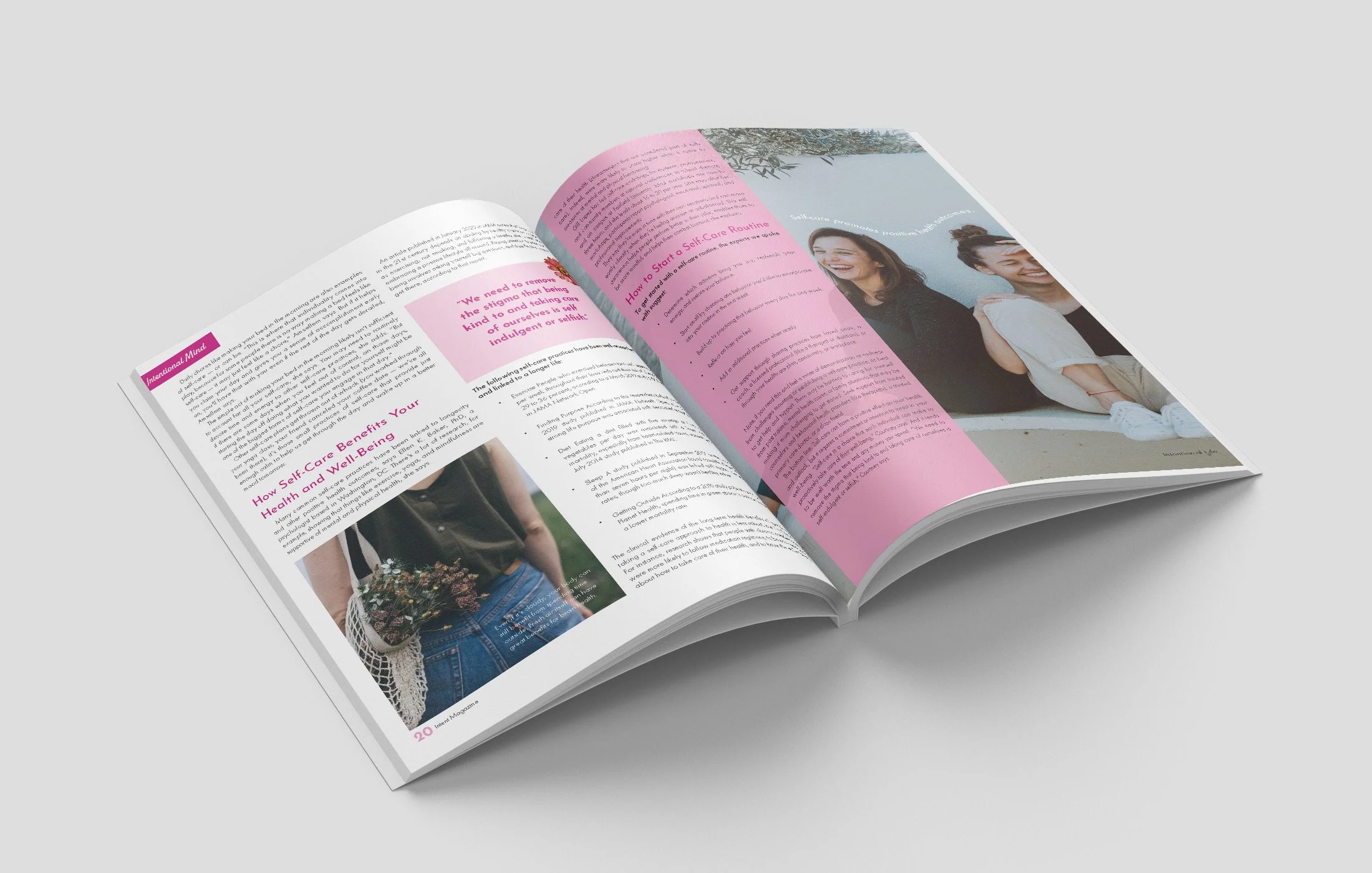
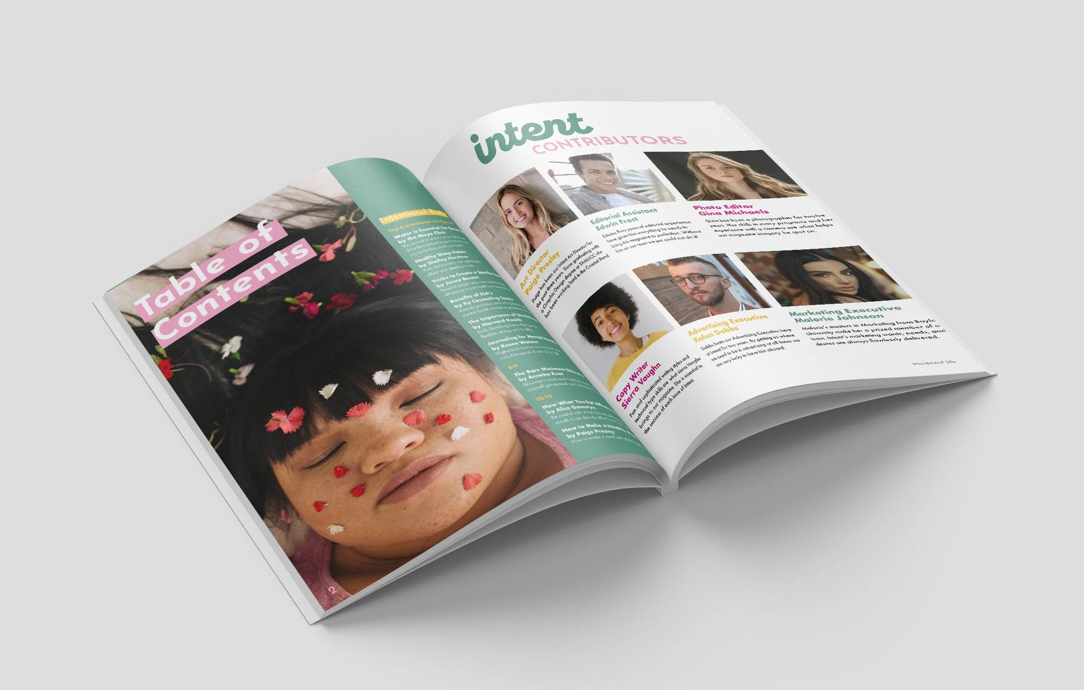
Overview: Intent is a lifestyle/self-care magazine geared towards those who want to make more intentional decisions to live their life in the healthiest way. possible. The goal of the publication is to inform readers about how to do right by their bodies and mind. Because of this, the magazine is split into two different sections “Intentional Body” and “Intentional Mind”. In each section, readers learn about things that can make them happier and healthier. A lot of magazines focus on taking care of your body or mental health but Intent is a magazine that focuses on both!
Solution: In order to appeal to young adults that are looking to build an intentional life, I created a youthful and approachable brand identity. Intent Magazine is filled with bright bold colors, friendly type, inviting images, and type treatments paired with insightful articles in order to create an enjoyable and enlightening experience.
Competitor Study
The competitors for my magazine are Breathe Magazine, Flow Magazine, and Psychology Today. These magazines relate to mine because they all have content based on self-help and topics related to overall well-being. My magazine stands out from these because I combine the mental health topics from Flow and Breathe and the more clinical health topics from Psychology Today. There is also a difference between Flow and Breathe in that Intent magazine is much more photo-driven than illustration driven.
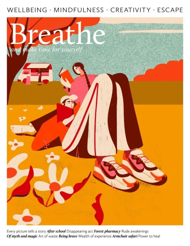
Breathe Magazine

Psychology Today
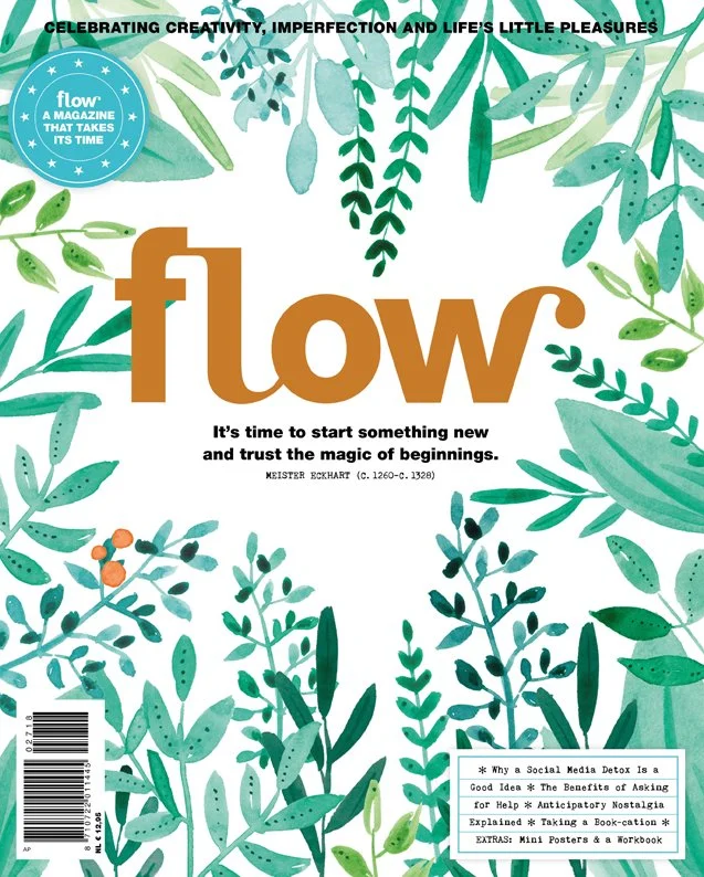
Flow Magazine
Style Choices
Typography: I chose Josefin Sans for my headings and subheadings. I made this selection because I think it matches the simple and inviting look of the magazine. I chose Futura for the body copy and caption options because it is easy to read at a small scale and pairs well with my heading type.
Colors: I chose colors that would make the viewer feel happy and calm. The bright tones match the articles featured in this magazine.
Image/Layout Inspiration: My goal was for this magazine to have a lot of beautiful imagery as the focal point. These images were meant to complement the articles with pleasing content and placement.

Logo Design
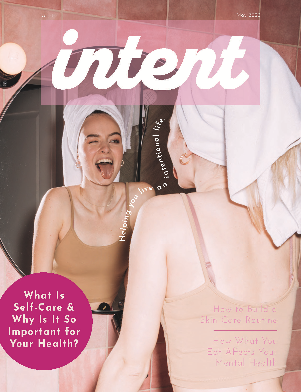
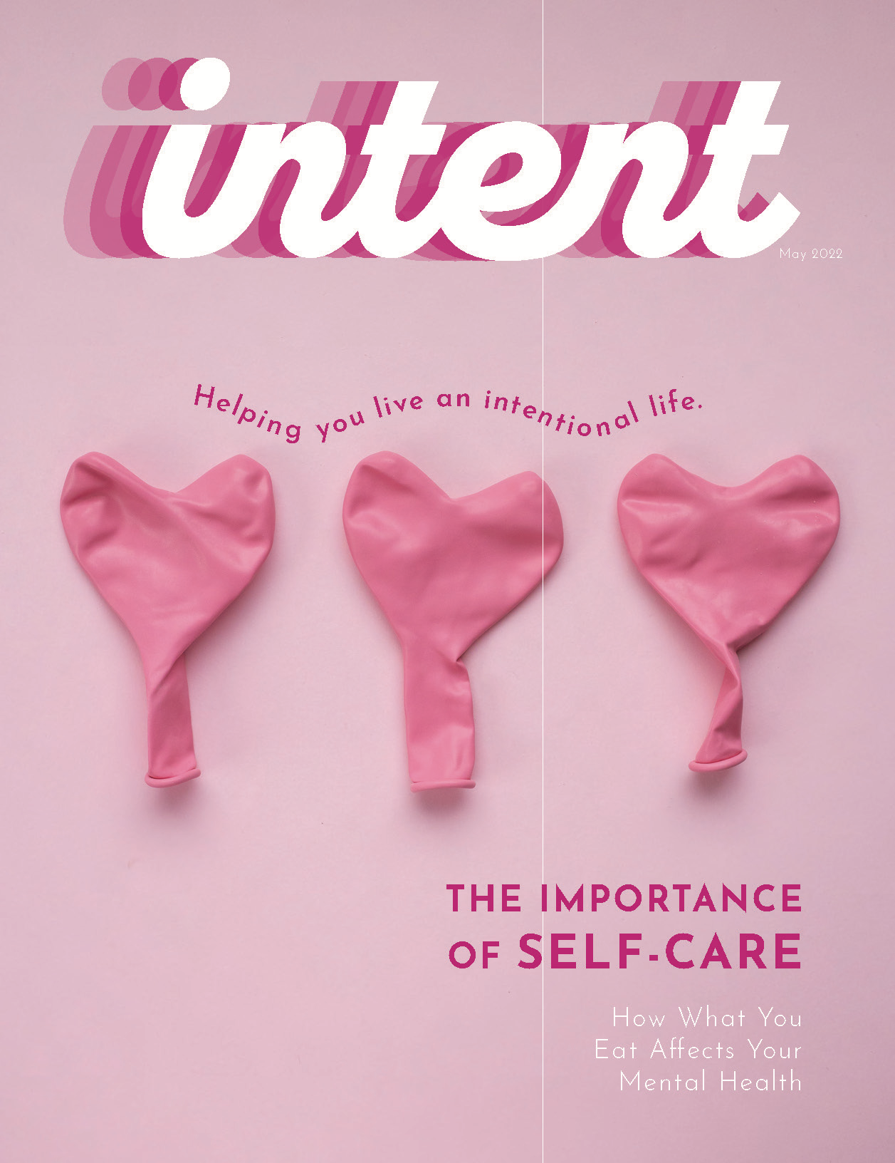
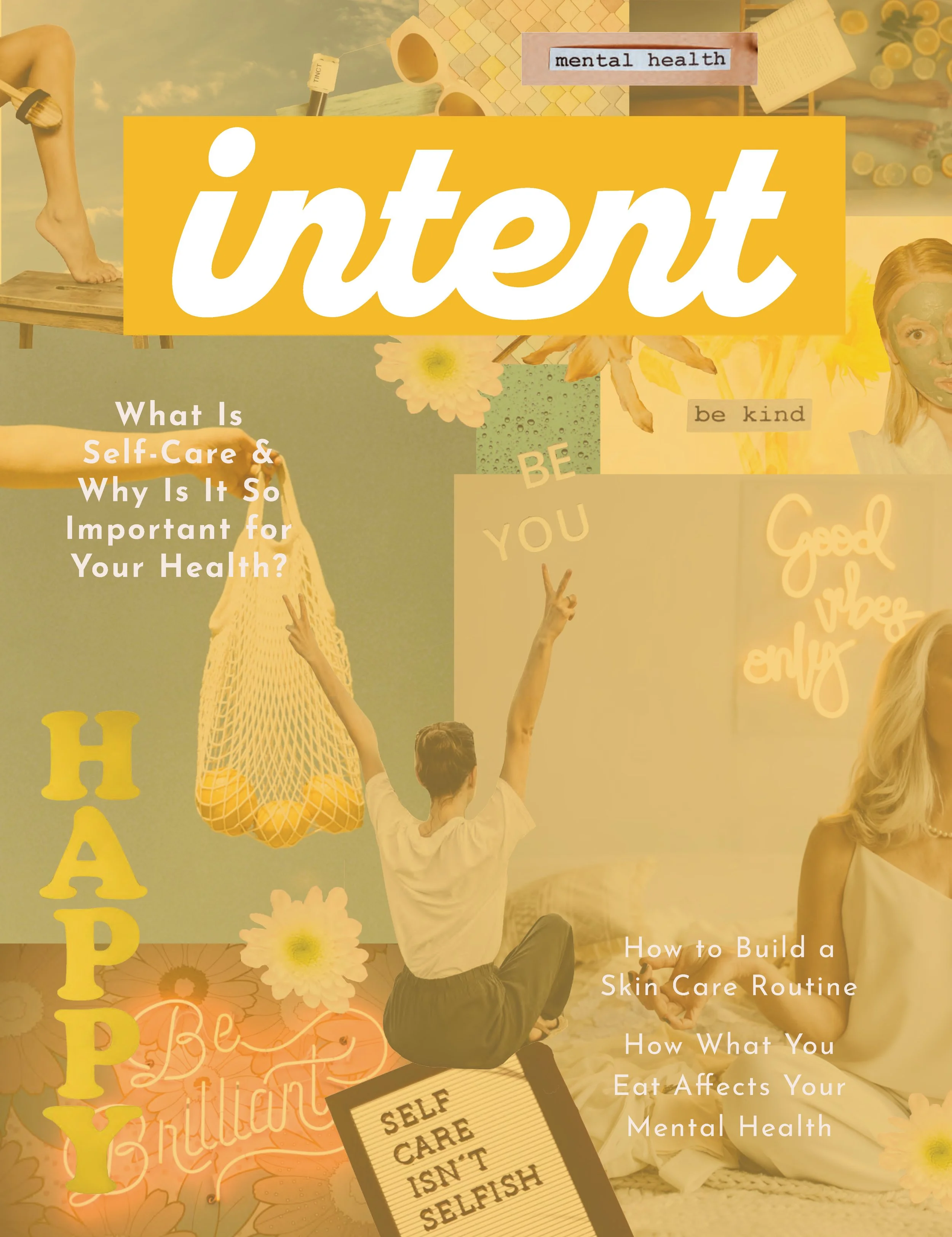
For my logo, I wanted to use a curvy and bold type to pair well with my bold color palette. I also wanted it to easily stand out on the front of a magazine. There was not just one typeface to give my logo the statement that I wanted it to make, so I chose a bold typeface and then personalized it myself so it had smoother edges and each letter connected in a similar way to make it a simple and easily digestible logo.

Digital Cover Process
I created many cover sketches, and multiple digital designs so that I could get multiple rounds of feedback. Through rounds of feedback, I was able to land on a cover design that promoted my brand and embodied the content found within the magazine.
Final Magazine
The final solution for this magazine is an intricate execution of information and design. The use of imagery and color is inviting and relaxing, and the articles are extremely informative. This final product showcases my long-format print publications skills, layout design skills, and brand identity design abilities as well.

Final Covers

Final Spreads